Project Overview
The project overview is the landing page for every project — a live dashboard of widgets showing telemetry, sensor health, alert summaries, and key performance indicators. It is the first thing you see after selecting a project.
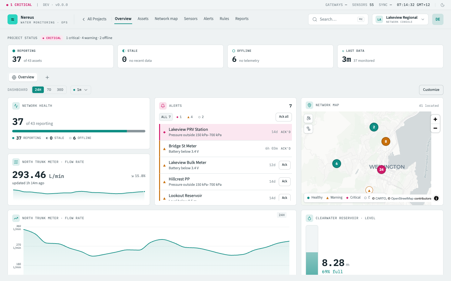
Network health strip
Section titled “Network health strip”At the top of the page, a status bar summarises the project’s alert posture at a glance — the worst open-alert severity is shown as a coloured badge with a count (e.g. “2 critical · 1 warning · 0 offline”). When there are no active alerts, a green “no active alerts” badge is displayed. The badge is also a way in — clicking it opens the Action Centre focused on this project, with per-kind guidance and the acknowledge / snooze actions.
Below the status bar, four stat cards tile across the page:
| Card | What it shows |
|---|---|
| Reporting | Assets that have sent telemetry within the staleness threshold, out of the project total. |
| Stale | Assets whose most recent reading is older than the staleness threshold — they are still |
| contacted but haven’t reported recently. | |
| Offline | Assets that have never sent telemetry or have been fully lost. Tinted red when count > 0. |
| Last data | Human-readable time since the most recent reading across the whole project, with a count |
| of monitored data points. |
Dashboard section
Section titled “Dashboard section”Below the network health strip sits the main dashboard area. It has two controls in its header row:
Dashboard switcher
Section titled “Dashboard switcher”A tab strip lets you switch between the project’s dashboards. The shared Overview dashboard is always pinned first and is visible to every project member. Personal dashboards — private to you — appear as additional tabs. Beyond six tabs the overflow collapses into a “+N more” menu. The + button creates a new personal dashboard.
Switching dashboards updates the URL (?dashboard=<id>) so the view is linkable.
Time range picker
Section titled “Time range picker”A segmented control with 24h / 7d / 30d options sets the time window for every time-series widget on the dashboard. Changing it refreshes all charts at once.
Auto-refresh
Section titled “Auto-refresh”A dropdown next to the time range lets you enable automatic data refresh at 30s, 1m, or 5m intervals. A pulsing green dot indicates refresh is active.
Customize mode
Section titled “Customize mode”Click Customize to enter edit mode. In this mode:
- Add widget opens a wizard where you can browse all 12 widget types, preview them live, and configure entity-bound widgets (e.g. choose which asset and metric a reading card shows).
- All tiles become draggable and resizable — grab the header strip to move, or the bottom-right corner to resize.
- Each tile has a dropdown with Configure (re-open the wizard for that widget) and Remove.
- Reset reverts the grid to the default layout.
Click Done to save the layout and exit edit mode.
Widget tiles
Section titled “Widget tiles”The grid uses a 12-column layout. Each widget type has a default and minimum tile size, and some are time-ranged (respond to the time range picker) while others show a fixed window.
Hovering any configured tile reveals an expand button — clicking it opens the widget in a large modal (focus view) with its own transient time-range picker for time-series widgets.
Related
Section titled “Related”- Sensors — enrol and manage devices
- Alerts — active alert feed and acknowledgement
- Act on alerts from the Action Centre — the health strip badge opens it, focused on this project